
It's been a roller coaster ride for the stock market over the past few months. After nearly reaching a cycle high in late July, the S&P 500® suffered a correction of a little more than -10% by the end of October, only to rebound more than 7% since then. It was an even sharper boomerang for the Nasdaq; having a correction of more than -12% between mid-July and the end of October, only to rebound by nearly 10% since then.
Performance, above and below surface
The performance table below, which goes on my X (Twitter) feed every day, dives into more detail on the stock market's behavior both year-to-date (YTD), and since last year's October low for the S&P 500. Perhaps most notable are the "average member maximum drawdown" columns for each period. Courtesy of the bias in performance toward a few mega-capitalization (mega-cap) stocks, the significant weakness under the surface of index-level performance has been somewhat masked. In particular, notice that the average Nasdaq member maximum drawdown from YTD highs is nearly -50%.
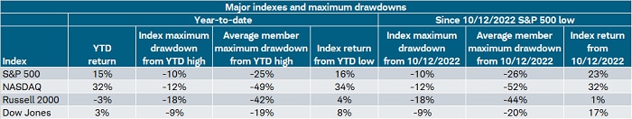
Source: Charles Schwab, Bloomberg, as of 11/10/2023.
Indexes are unmanaged, do not incur management fees, costs and expenses and cannot be invested in directly. Past performance is no guarantee of future results. Some members excluded from year-to-date return columns given additions to indices were after January 2023.
Magnificent 7 (out)shining
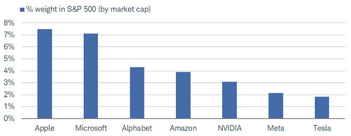
In terms of sector-level behavior during the correction phase, deep cyclicals and interest-rate-sensitive segments of the market—like Real Estate Investment Trusts (REITs) and Consumer Discretionary—fell the most, while Energy performed the best (but still fell by -3%). Conversely, the sharp rally from the late October low has been led by the "big 3" sectors that house the "Magnificent 7" (Mag7): Technology, Communication Services, and Consumer Discretionary. Within the Technology sector are Apple, Microsoft, and NVIDIA; within the Communication Services sector are Alphabet (Google), and Meta; and within the Consumer Discretionary sector are Amazon and Tesla. Each of the Mag7 weightings with the S&P 500 are shown below.
Mag7's monster weights
Source: Charles Schwab, Bloomberg, as of 11/10/2023.
Individual stocks are shown for illustration purposes only. "Magnificent 7" (Mag7) represents Alphabet, Amazon, Apple, Meta, Microsoft, NVIDIA, Tesla.
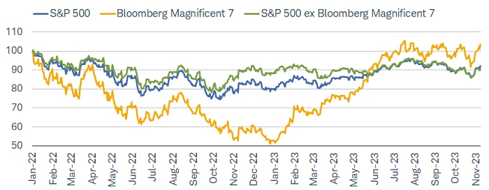
The performance bias of the Mag7 can be clearly seen in the chart below, covering the period since the early-2022 market top that ushered in last year's bear market. It's a stark reminder that although the Mag7 has been this year's darling group (shown via the ascendency of the yellow line in 2023), they represented the ultimate drag during 2022's bear market; only accelerating sharply relative to the overall S&P 500 and the S&P ex-Mag7 since the beginning of this year.
Mag7 from drag to dominance
Source: Charles Schwab, Bloomberg, as of 11/10/2023.
Data indexed to 100 (base value = 1/3/2022). An index number is a figure reflecting price or quantity compared with a base value. The base value always has an index number of 100. The index number is then expressed as 100 times the ratio to the base value. The Bloomberg Magnificent 7 Index is an equal-dollar weighted equity benchmark consisting of a fixed basket of 7 widely-traded companies (Alphabet, Amazon, Apple, Meta, Microsoft, NVIDIA, Tesla.) Indexes are unmanaged, do not incur management fees, costs and expenses and cannot be invested in directly. Past performance does not guarantee future results.
Although the stocks are often lumped together for analysis, it is the case that they have not behaved as a monolith, as shown below via the maximum drawdowns chart which I put on my X (Twitter) feed every day. They are the seven largest stocks within the S&P 500, but don't confuse size with performance. Yes, they all have strong YTD performance, but their ranking within the index is as follows: NVIDIA-1st, Meta-2nd, Tesla-9th, Amazon-11th, Microsoft-24th, Alphabet-28th, and Apple-33rd.
Mag7 not a monolith
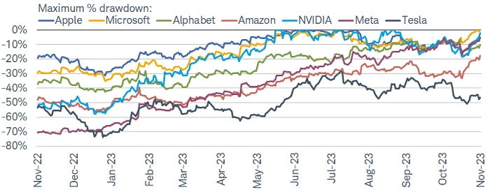
Source: Charles Schwab, Bloomberg, as of 11/10/2023.
Individual stocks are shown for illustration purposes only. "Magnificent 7" (Mag7) represents Alphabet, Amazon, Apple, Meta, Microsoft, NVIDIA, Tesla. Past performance is no guarantee of future results.
Specific to this year so far, less than a third of S&P 500 stocks have outperformed the overall index during the past three months. That is above the record low of 19% on June 1 this year, but it has remained below 50% since the end of February. The long-term average of that statistic is just below 50%. (Hat tip Ned Davis Research for the historical stats.)
Mag7 as its own sector
Our friends at Strategas Research Partners recently wrote an interesting report highlighting what the Mag7's characteristics would be if it were its own sector within the S&P 500. We dive in with some updates here. As shown below, if the Mag7 were its own sector, it would be the largest, at 30% of the overall index. That eclipses the current largest weight associated with the Technology sector.
Mag7 as its own sector
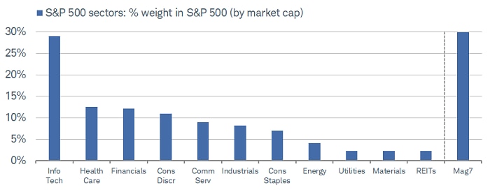
Source: Charles Schwab, Bloomberg, as of 11/10/2023.
For illustrative purposes only. "Magnificent 7" (Mag7) represents Alphabet, Amazon, Apple, Meta, Microsoft, NVIDIA, Tesla.
The Mag7 would not only be the largest sector in terms of weight within the S&P 500 index; when comparing sectors' market cap with net income, it would represent the largest spread, as shown below. In other words, its market cap weight is not "justified" by its net income weight. On the other end of the spectrum are the Financials and Energy sectors, both carrying significantly larger net income weights relative to their market cap weights.
Market cap vs. net income
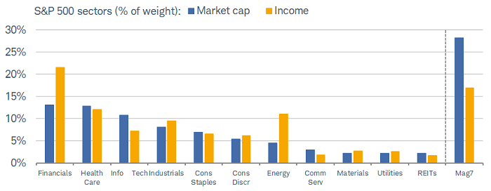
Source: Charles Schwab, Strategas Research Partners, as of 10/20/2023.
For illustrative purposes only. "Magnificent 7" (Mag7) represents Alphabet, Amazon, Apple, Meta, Microsoft, NVIDIA, Tesla. Past performance is no guarantee of future results.
In terms of sector laggards during the rally off the correction lows of late October, Energy takes the prize and is the only sector in negative territory, largely due to the reversal lower in oil prices. One major theme throughout the correction phase was the inability of traditional defensives to work like they are "supposed to" in selloffs. Namely, Utilities and Consumer Staples did not provide any kind of edge, having underperformed the overall S&P 500. We do not believe that's an aberration. Staples have struggled this year as disinflation has dented their pricing power, while Utilities—typically considered bond proxies—have been under increasing pressure from the recent upward move in Treasury yields.
Sector volatility abounds
Below is our take on the traditional asset class "quilt," which typically shows broad asset classes ranked by year. Instead, we show all 11 of the S&P 500's sectors, ranked by month over the past year. You can see the extraordinary month-to-month volatility of sector performance—with a glaring example being Energy sitting atop the leaderboard for three consecutive months starting in July, only to find itself at the bottom of the pile in October (also notice that in seven months of the one-year period shown, Energy was either at the very bottom or very top). Even Utilities have bounded a few times from the very top to the very bottom.
Sectors all over the quilt
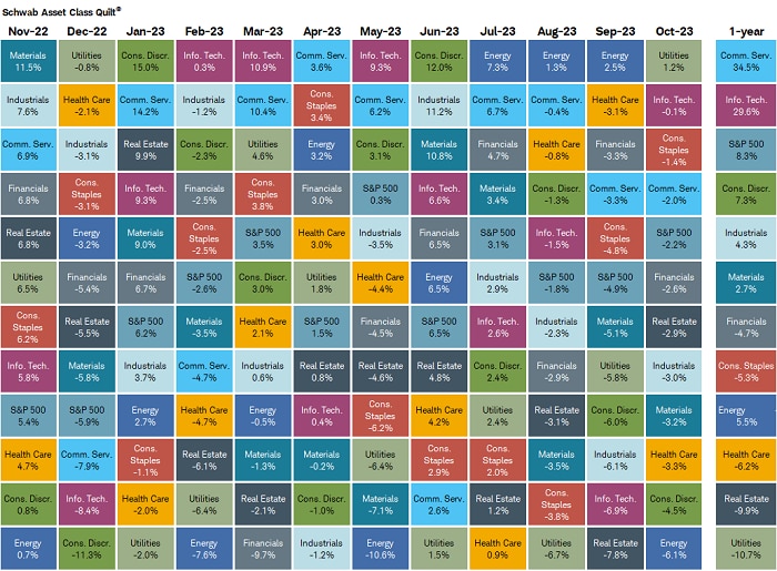
Source: Charles Schwab, Bloomberg, as of 10/31/2023.
Sector performance is represented by price returns of the following 11 GICS sector indices: Consumer Discretionary Sector, Consumer Staples Sector, Energy Sector, Financials Sector, Health Care Sector, Industrials Sector, Information Technology Sector, Materials Sector, Real Estate Sector, Communication Services Sector, and Utilities Sector. Returns of the broad market are represented by the S&P 500. Indexes are unmanaged, do not incur management fees, costs and expenses and cannot be invested in directly. Past performance is no guarantee of future results.
It's no coincidence that REITs and Utilities are the two worst-performing sectors over the past year, with both sectors hovering near multi-year lows. It's one reason why we've been emphasizing that the S&P 500's advance since its October 2022 low does not yet look like a strong/durable new bull market. The reality in a higher-for-longer interest environment is that investors may have to leave monolithic mindsets behind. Traditional "defensives" have not provided downside protection to the same degree they have in the past.
For what it's worth, factor performance (based on how stocks screen on certain characteristics) has been more consistent. As most readers know, we have been very focused on factors vs. sectors during this market cycle, with a particular emphasis on quality-oriented factors like high interest coverage, low volatility, and strong free cash flow. Interest coverage has been one of the best-performing factors this year, with less volatility than sector-based performance.
Bond yields driving stock market
Helping explain interest coverage as a dominant factor in terms of performance is the close connection between bond yields and stock prices—even when muting the impact of the Mag7. Shown below, since the S&P 500 peaked on July 31 this year, the inverse correlation between the S&P Equal Weight index and the 10-year Treasury yield has been nearly perfect (we inverted the 10-year yield so the relationship is clear to see).
Bond yields driving stocks
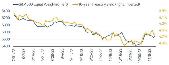
Source: Charles Schwab, Bloomberg, as of 11/10/2023.
Correlation is a statistical measure of how two investments have historically moved in relation to each other, and ranges from -1 to +1. A correlation of 1 indicates a perfect positive correlation, while a correlation of -1 indicates a perfect negative correlation. A correlation of zero means the assets are not correlated.
Even as bond yields are lower than their recent peak, they continue to hover around the highest level in more than a decade. This has been disruptive for companies that are heavily indebted; especially those which haven't termed out their debt and/or don't have strong enough cash flows to cover rising interest expense. This has put emphasis on sectors like Utilities—which has a low and falling interest coverage ratio—and REITs. For the latter, as shown below, it's the weakest in terms of interest expense as a percentage of revenue. Interestingly, as you can see at the far right in the chart below, if the Mag7 were its own sector, it would have the lowest interest expense as a percentage of revenue. That represents one of the key "fundamental" supports of the group's outperformance this year.
Mag7's miniscule interest expense
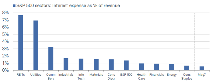
Source: Charles Schwab, Strategas Research Partners, as of 10/20/2023.
For illustrative purposes only. "Magnificent 7" (Mag7) represents Alphabet, Amazon, Apple, Meta, Microsoft, NVIDIA, Tesla.
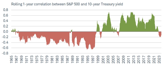
As regular readers of our work know (Say Goodbye…to Great Moderation? | Charles Schwab), we have been highlighting the inverse relationship between bond yields and stock prices as one sign that we are likely transitioning to a different secular backdrop relative to the Great Moderation era from the late 1990s to the start of the pandemic. We believe this new secular era may be somewhat akin to what we've been calling the "Temperamental Era" spanning from the mid-1960s to the late 1990s. During that span, there was a consistent inverse relationship between bond yields and stock prices, when measured on a one-year rolling basis. During the Great Moderation, it was the opposite: nearly the entire period was characterized by a positive correlation. This is clearly shown below.
Dawn of a new (old) era?
Source: Charles Schwab, Bloomberg, as of 11/10/2023.
Correlation is a statistical measure of how two investments have historically moved in relation to each other, and ranges from -1 to +1. A correlation of 1 indicates a perfect positive correlation, while a correlation of -1 indicates a perfect negative correlation. A correlation of zero means the assets are not correlated. Past performance is no guarantee of future results.
What now?
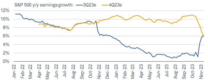
This week is chock-full of economic data, including the much-anticipated consumer price index (CPI) and producer price index (PPI) inflation reports, retail sales and several key housing-related reports. We're also closing the book on earnings season; but the important messages from many retailers are still in front of us given they typically have a one-month-later fiscal year end. As shown below, third-quarter earnings season has been decent courtesy of a higher-than-average "beat rate," which means the "blended growth rate" (incorporating reports already in the books with estimates for companies not yet having reported) has moved up sharply from only 1% in mid-October to more than 6% as of Friday. However, notice the mirror image move down in estimates for the fourth quarter, from about 11% in late September to less than 6% as of Friday. This is denting the "earnings have put in a bottom" refrain, evident as recently as a month ago.
Mirror-image quarters for earnings?
Source: Charles Schwab, LSEG I/B/E/S, as of 11/10/2023.
Forecasts contained herein are for illustrative purposes only, may be based upon proprietary research and are developed through analysis of historical public data. Past performance is no guarantee of future results.
There have been a few shorter-term "breadth thrusts" during the latest rally, but they haven't yet had a significant impact on longer-term breadth. For the S&P 500, only 50% of its stocks are trading above their 50-day moving averages; while it's only 38% for the Russell 2000 and 34% for the Nasdaq. Relative to their 200-day moving averages, they are 42% for the S&P 500, 30% for the Russell 2000, and 27% for the Nasdaq. In the meantime, although it's been a nice two-week reprieve from the selling during the correction phase, only 5% of the S&P 500's members have made a new 52-week high.
We are hoping to see a broadening out in terms of performance, with less dominance by the Mag7. However, we continue to think leadership (within and beyond the Mag7) will be defined by high quality factors. It's a theme we will address in more detail in our 2024 outlook report being published in a couple of weeks, so stay tuned, stay up in quality, and stay disciplined.
See Schwab's commentary on US markets.
More from Charles Schwab
Stocks Extend November Gains Ahead of Holiday
Opening Market Update
Closing Market Update
Related topics
The information provided here is for general informational purposes only and should not be considered an individualized recommendation or personalized investment advice. The investment strategies mentioned here may not be suitable for everyone. Each investor needs to review an investment strategy for his or her own particular situation before making any investment decision.
All expressions of opinion are subject to change without notice in reaction to shifting market conditions. Data contained herein from third-party providers is obtained from what are considered reliable sources. However, its accuracy, completeness or reliability cannot be guaranteed. Examples provided are for illustrative purposes only and not intended to be reflective of results you can expect to achieve.
Past performance is no guarantee of future results and the opinions presented cannot be viewed as an indicator of future performance.
Investing involves risk including loss of principal.
The policy analysis provided by the Charles Schwab & Co., Inc., does not constitute and should not be interpreted as an endorsement of any political party.
Performance may be affected by risks associated with non-diversification, including investments in specific countries or sectors. Additional risks may also include, but are not limited to, investments in foreign securities, especially emerging markets, real estate investment trusts (REITs), fixed income and small capitalization securities. Each individual investor should consider these risks carefully before investing in a particular security or strategy.
All corporate names and market data shown above are for illustrative purposes only and are not a recommendation, offer to sell, or a solicitation of an offer to buy any security. Supporting documentation for any claims or statistical.
Diversification strategies do not ensure a profit and do not protect against losses in declining markets.
Schwab does not recommend the use of technical analysis as a sole means of investment research.
Commodity-related products carry a high level of risk and are not suitable for all investors. Commodity-related products may be extremely volatile, illiquid and can be significantly affected by underlying commodity prices, world events, import controls, worldwide competition, government regulations, and economic conditions.
Source: Bloomberg Index Services Limited. BLOOMBERG® is a trademark and service mark of Bloomberg Finance L.P. and its affiliates (collectively "Bloomberg"). Bloomberg or Bloomberg's licensors own all proprietary rights in the Bloomberg Indices. Neither Bloomberg nor Bloomberg's licensors approves or endorses this material or guarantees the accuracy or completeness of any information herein, or makes any warranty, express or implied, as to the results to be obtained therefrom and, to the maximum extent allowed by law, neither shall have any liability or responsibility for injury or damages arising in connection therewith.
Indexes are unmanaged, do not incur management fees, costs, and expenses, and cannot be invested in directly. For additional information, please see schwab.com/indexdefinitions.
1123-3GNV